This egg-based product was in need of some reinvigorating to step up their sales on the shelves. The team at OvaEasy reached out looking to refresh their brand and their Egg In A Cup packaging design. We began our proven process for such a task and here's the amazing results.
Ok, we weren't scrambling. We just needed to work in that egg pun.
By evaluating the old packaging and our discovery process with OvaEasy we learned the product had seen some good initial sales but had leveled off a bit. That told us there's an interested audience but perhaps not the one originally anticipated. The old packaging came off as dull and cheap.
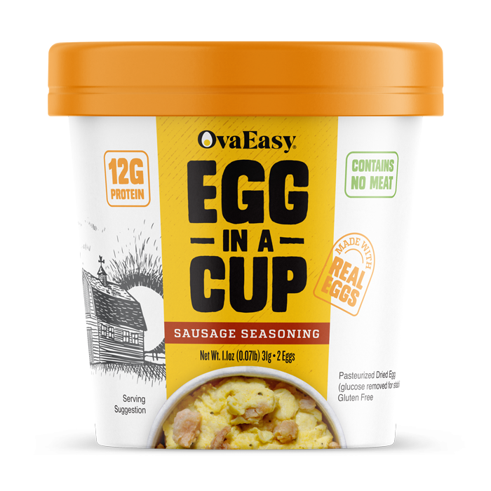
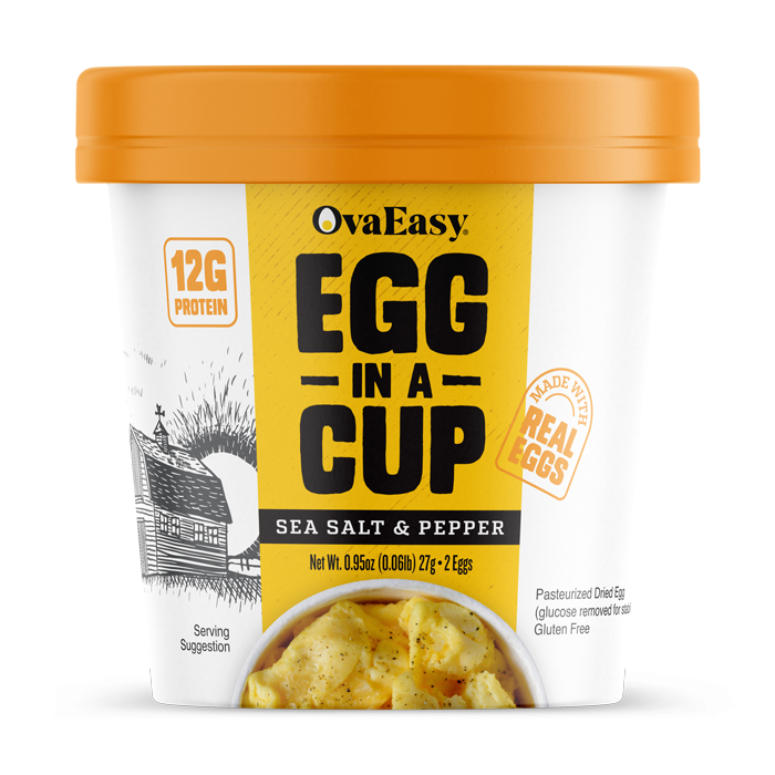
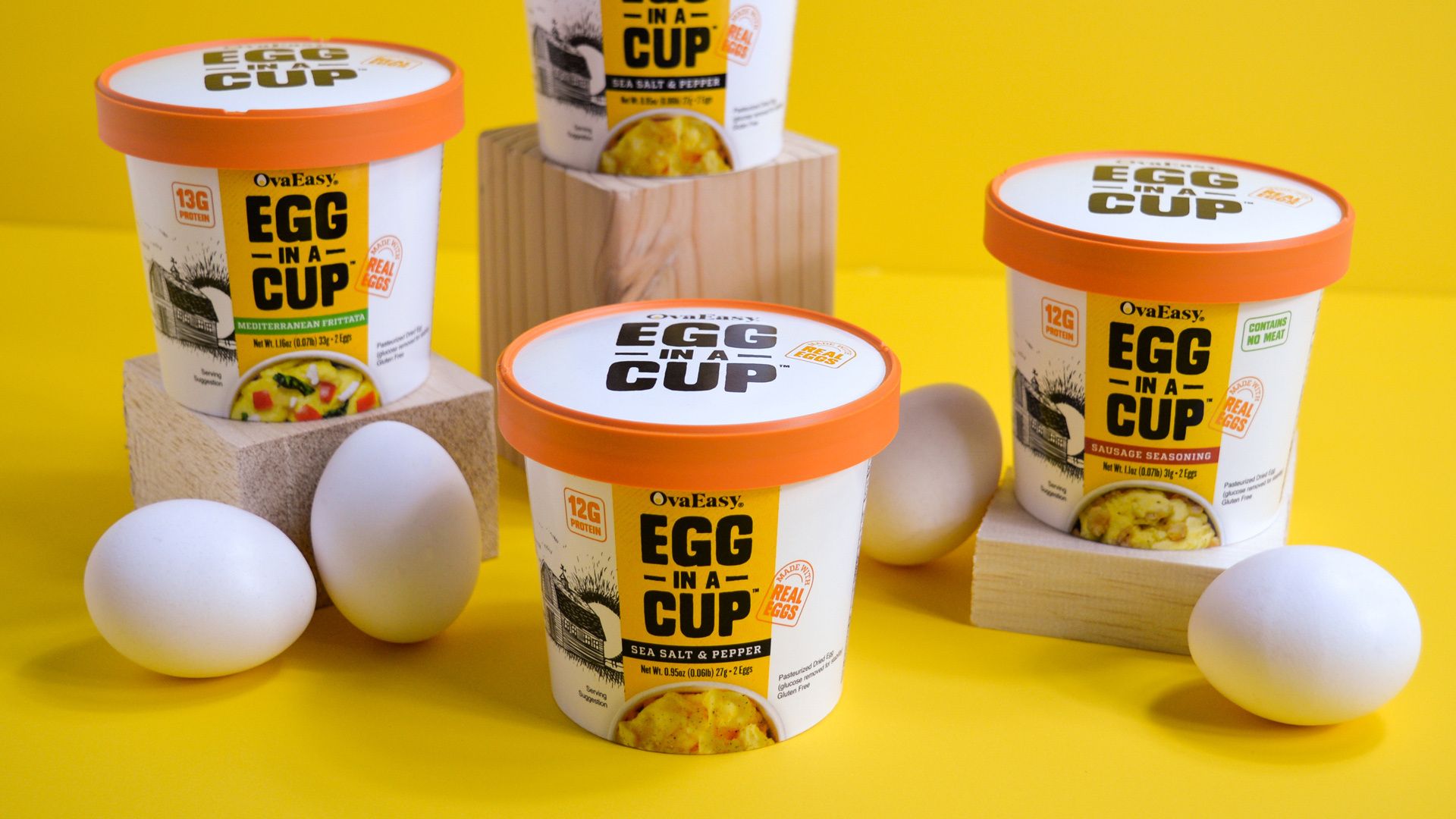
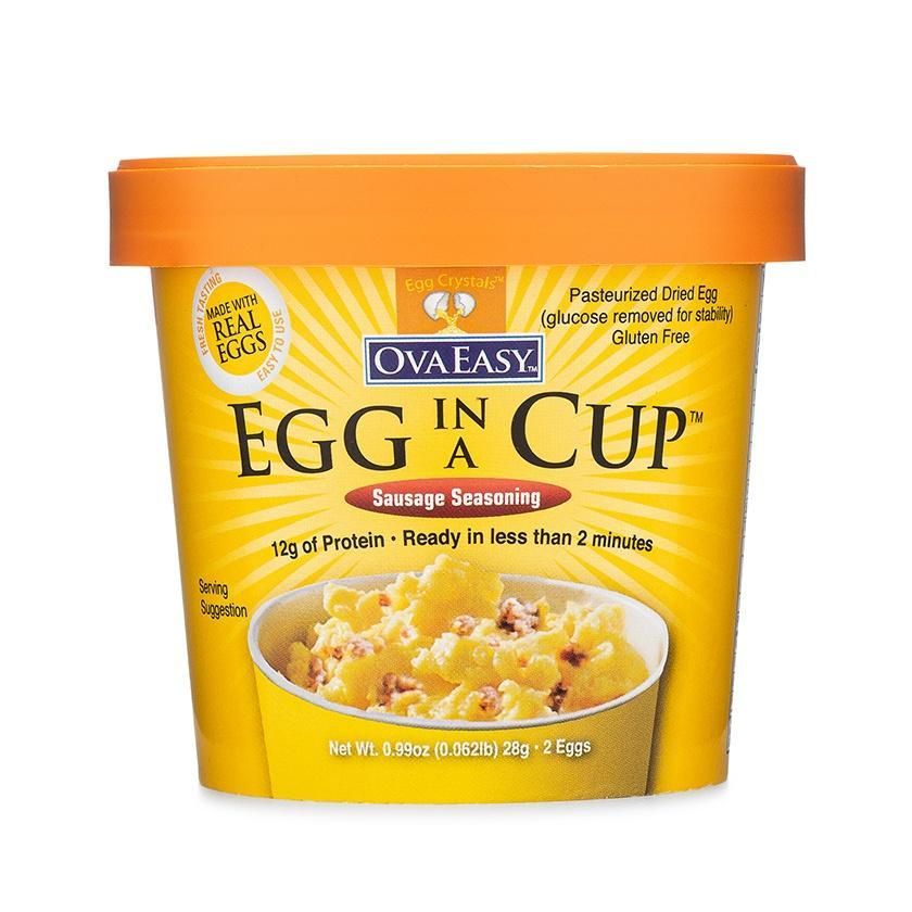
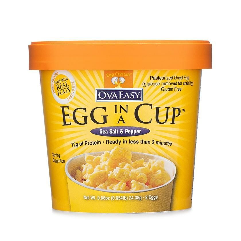
While the old design was lacking in appeal, there clearly were elements that were important to keep. Mainly, the color yellow and the orange lid were important for recognition with current customers.
Our new design of this handy little package focused primarily on fixing mistakes and sending the right message. We simplified and cleaned up the space so it's easier to digest quickly. We highlighted only the most important pieces of information. Most important, we gave the product name a bolder look so it was more of a focal point and easier to read from a distance.
Creatively, we made vast improvements in the appeal to the consumer. The mostly white look has a perception of higher quality than the all yellow cup had. We added some nice texture and a background illustration to give a comfortable, welcoming vibe.