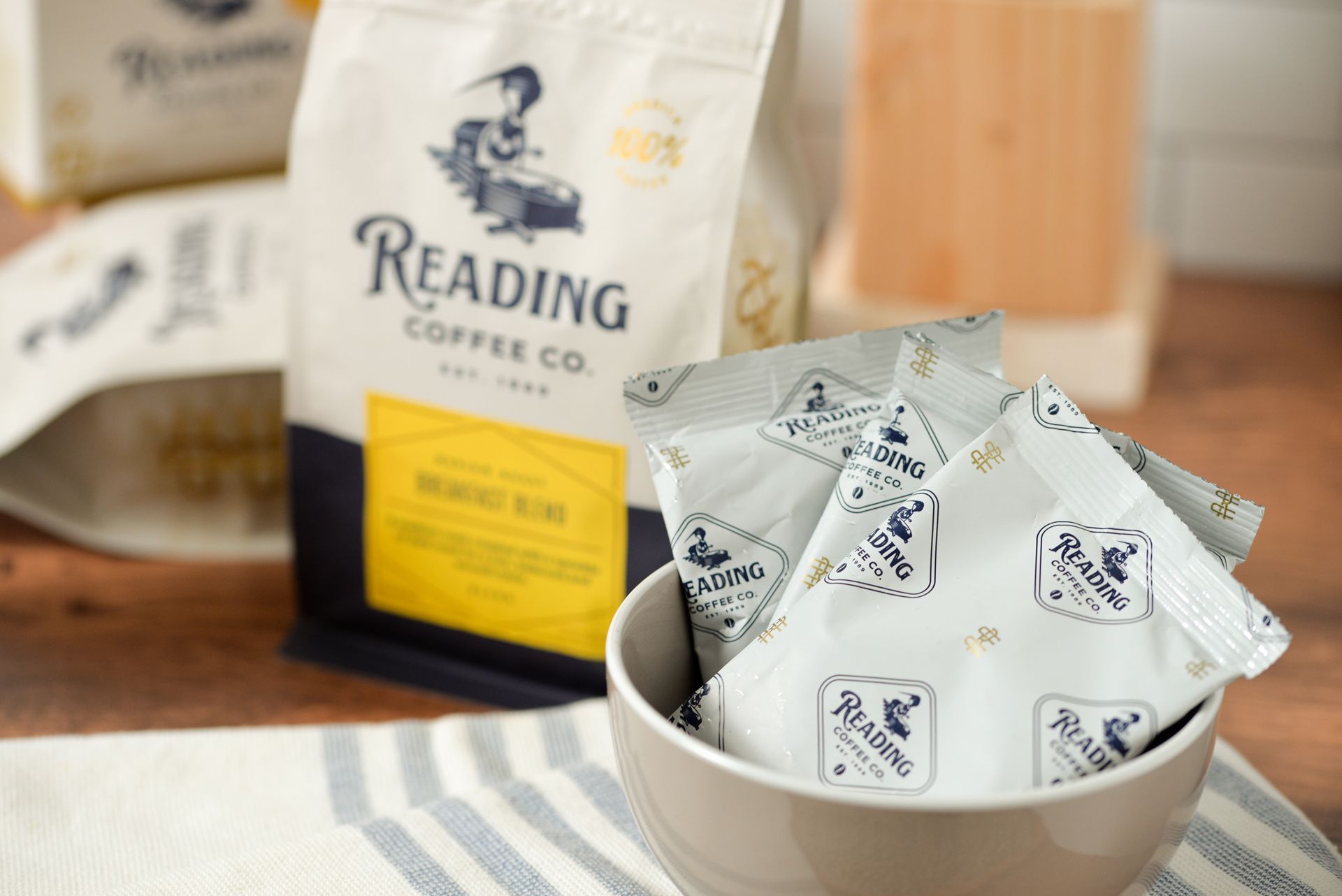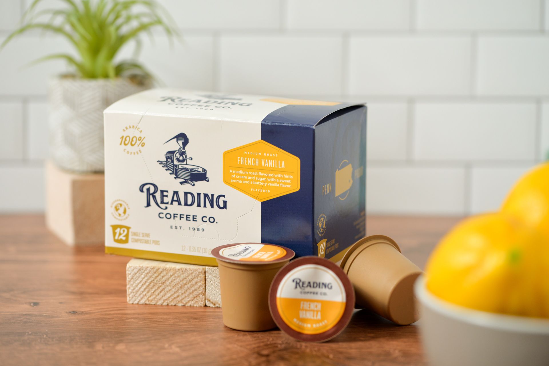


Named after the historic railroad city in which it resides, this roastery has also become a staple of the community. With a major café project in the works it seemed like a good time to take a step forward in the growth of the brand. We partnered with Reading Coffee Company to develop a clear brand image and tone to appeal to its local customers.
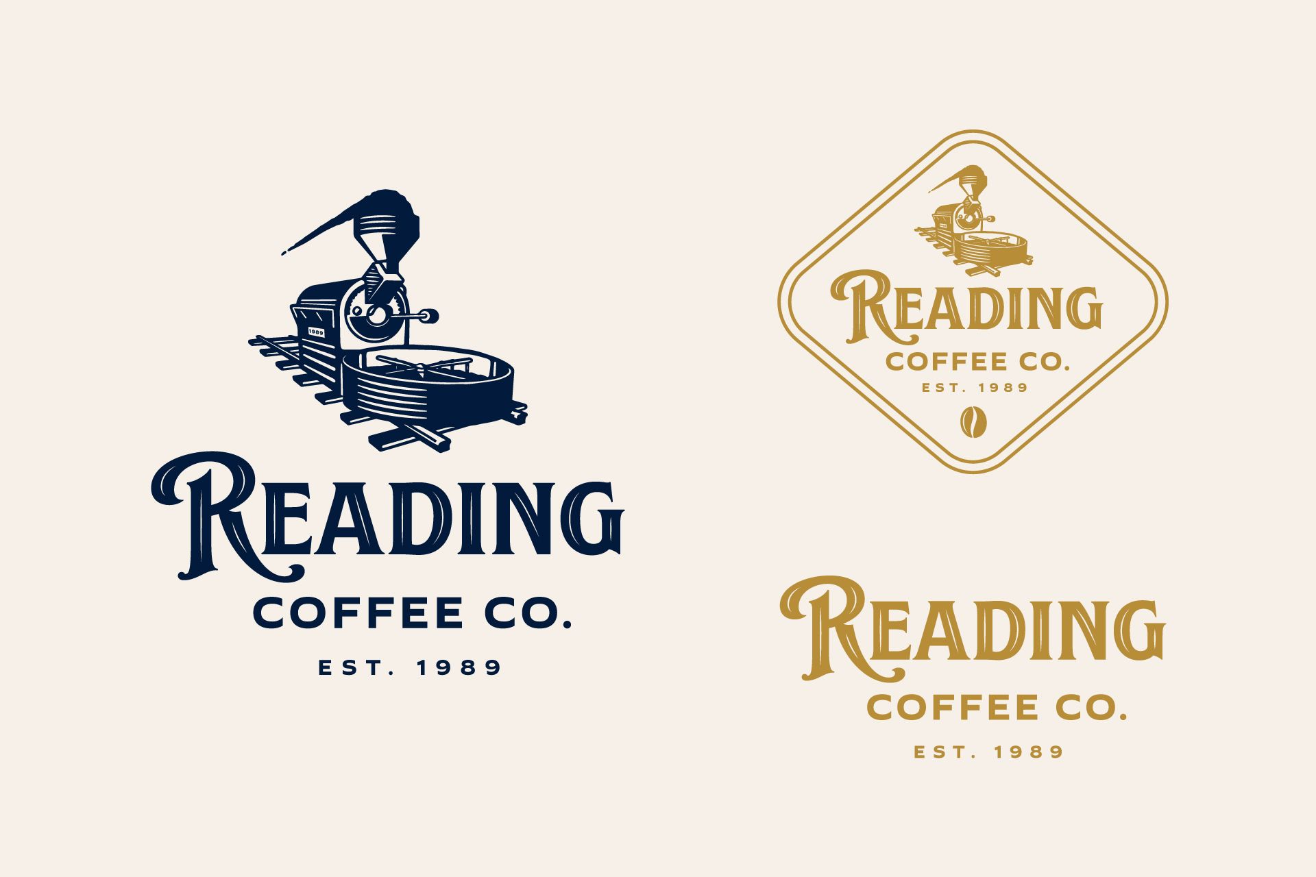
The Reading Coffee Company's goal was to tie their brand even deeper to the community that supports them. With such a rich history of the railroad industry our strategy was to tie in imagery from an era when the trains were tops for transportation. The new logo even combined a coffee roaster with a steam engine rolling down the tracks.
We also tied in locally recognized landmarks with the packaging. This helped the brand "feel like home" to local residents.

The entire creative process with Avidity, from proposals, concept dreaming and ideas, our total rebranding through printing and completion when the finished packaging products finally arrive, was a pleasure. Adam is a joy to work with, extremely responsive and very detail oriented to make sure the best possible outcome is the result of whatever we're working on.
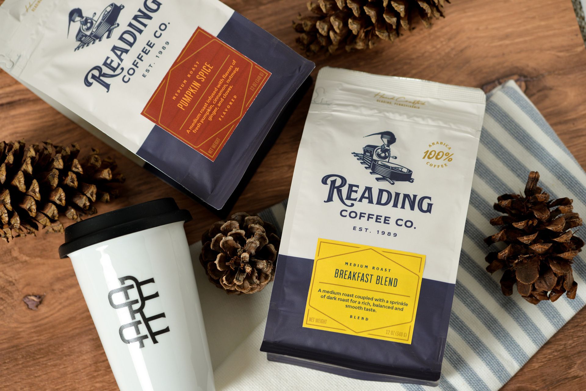
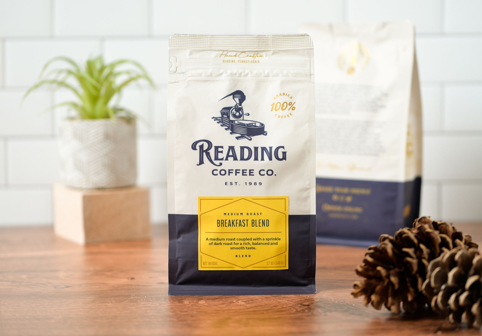
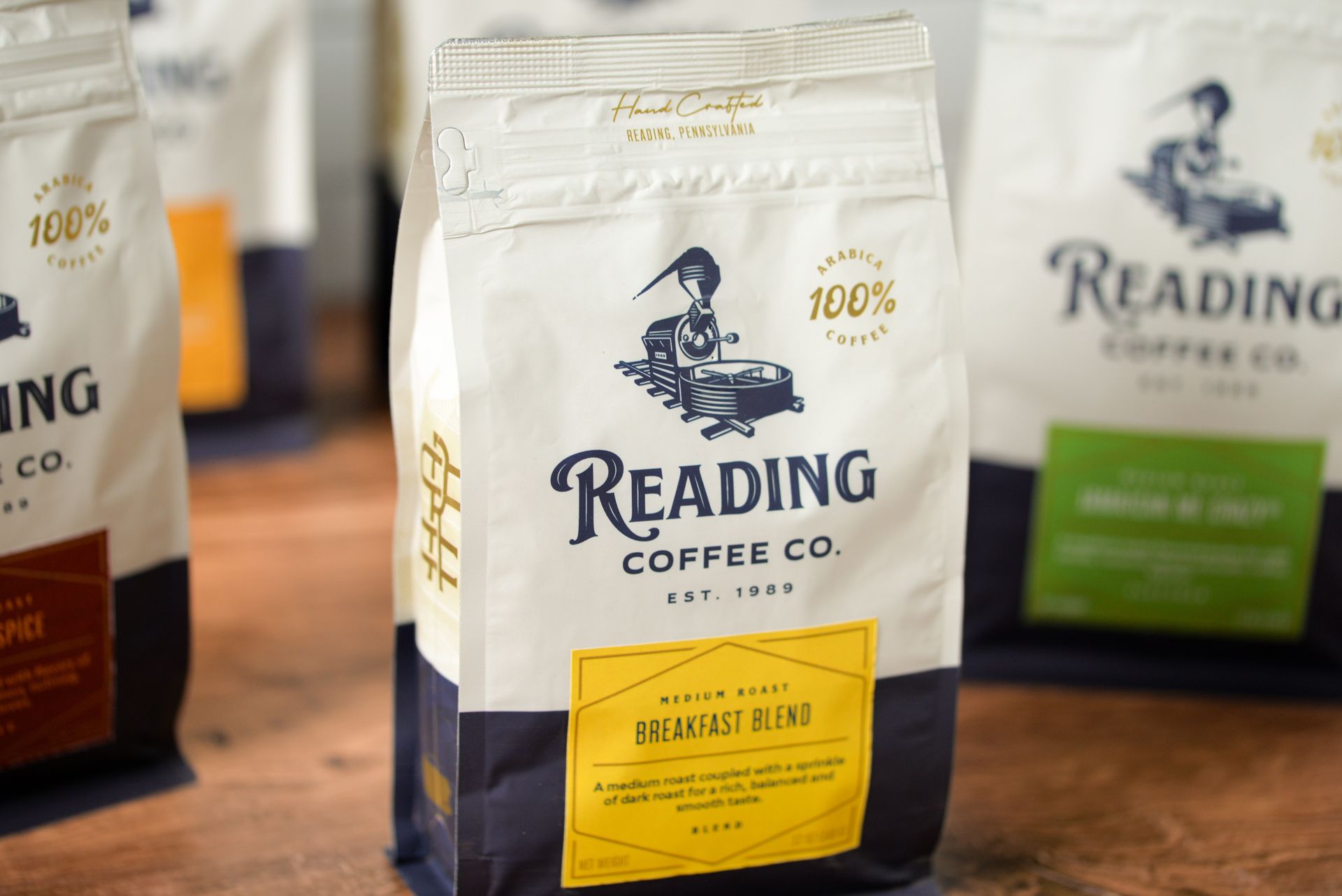
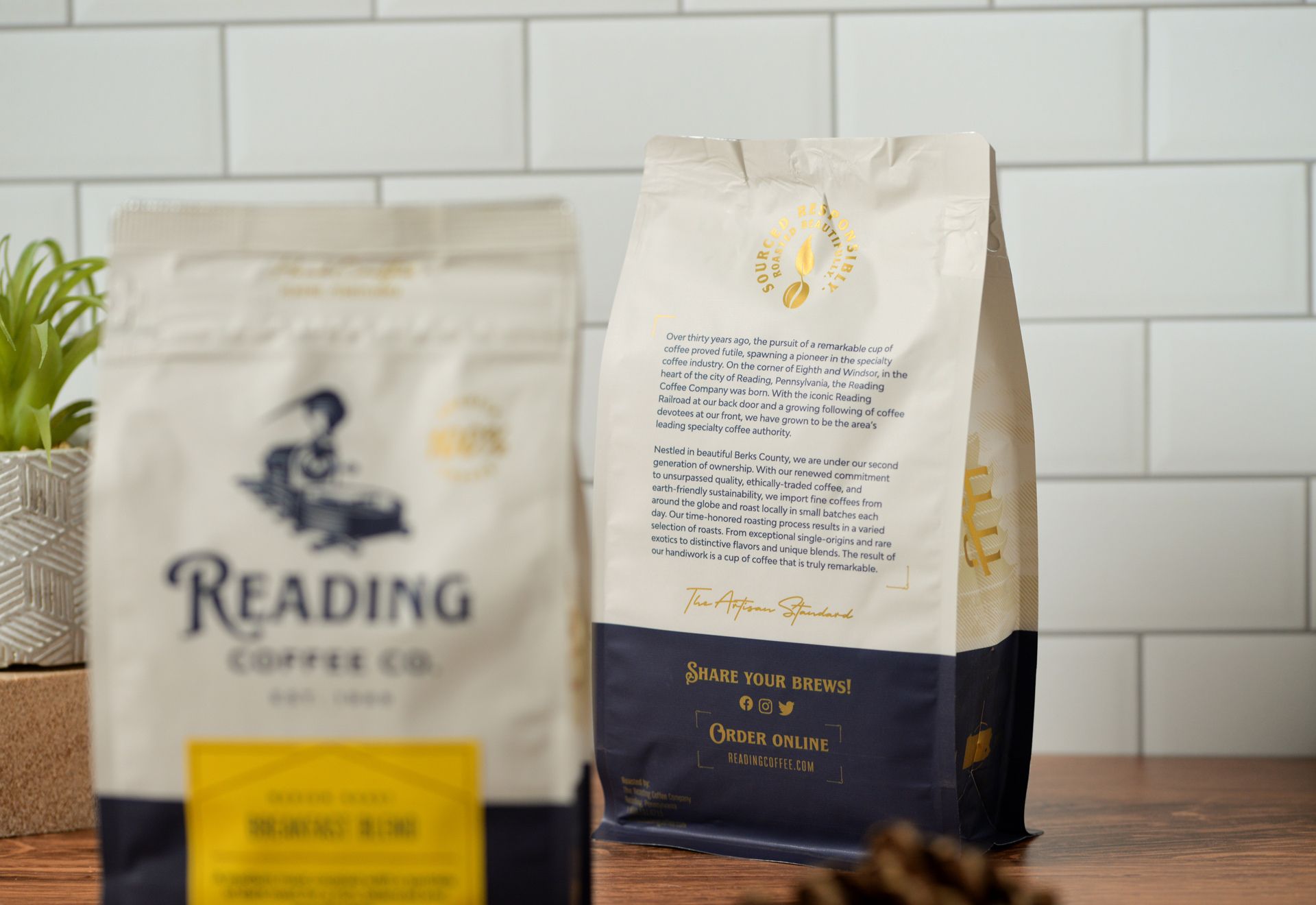
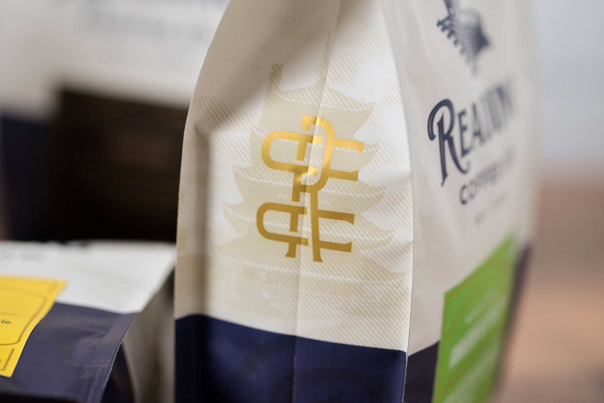
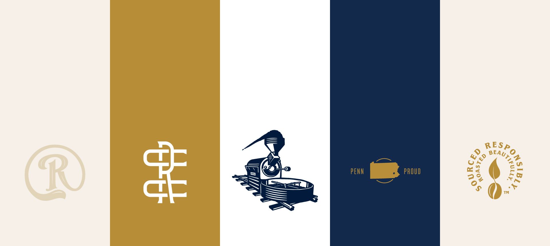
In order to capture the nostalgic feel we were going for we used vintage font styles and hand-written script fonts as well as appropriate gold accents. However, we also needed the brand to fit the more modern customers. To do this we avoided any rough textures and overwhelming patterns. The solid colors capture attention that's needed.
The brand expanded from logo and packaging design to merchandise and signage around the new cafe. So, it was important that the brand be flexible and we developed secondary logo marks and icons to suit those needs.


