Kaylaan
From category copycat to standout challenger
Kaylaan entered the toothpaste tablet category at a time when a few early brands had already defined what the space looked like. The problem was, Kaylaan looked just like them.
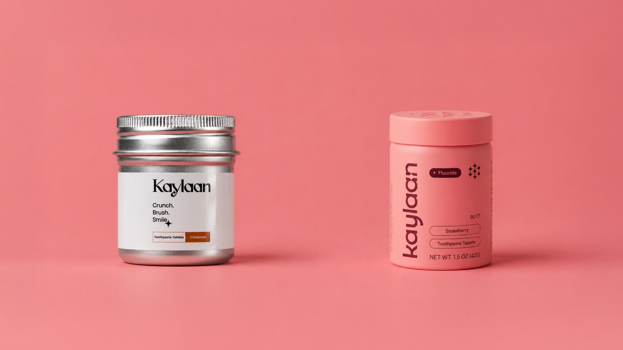
Their packaging leaned clinical and pharmaceutical, with a generic silver tin and wrap label that made the brand feel small, new, and easily replaceable. Even their messaging closely mirrored competitors. In a category where trust and credibility are everything, they weren’t giving consumers a strong enough reason to choose them.
We needed to reposition Kaylaan as a brand that felt just as credible as the category leaders, but with a clearer identity and stronger presence.
Brand Identity
Packaging System Design
Trade Show
Sales Materials
Rather than reinventing the category, we made a more strategic move.
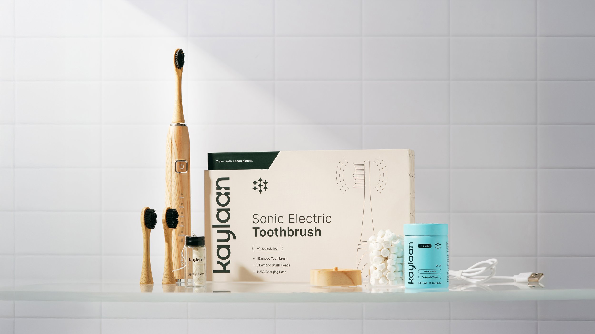
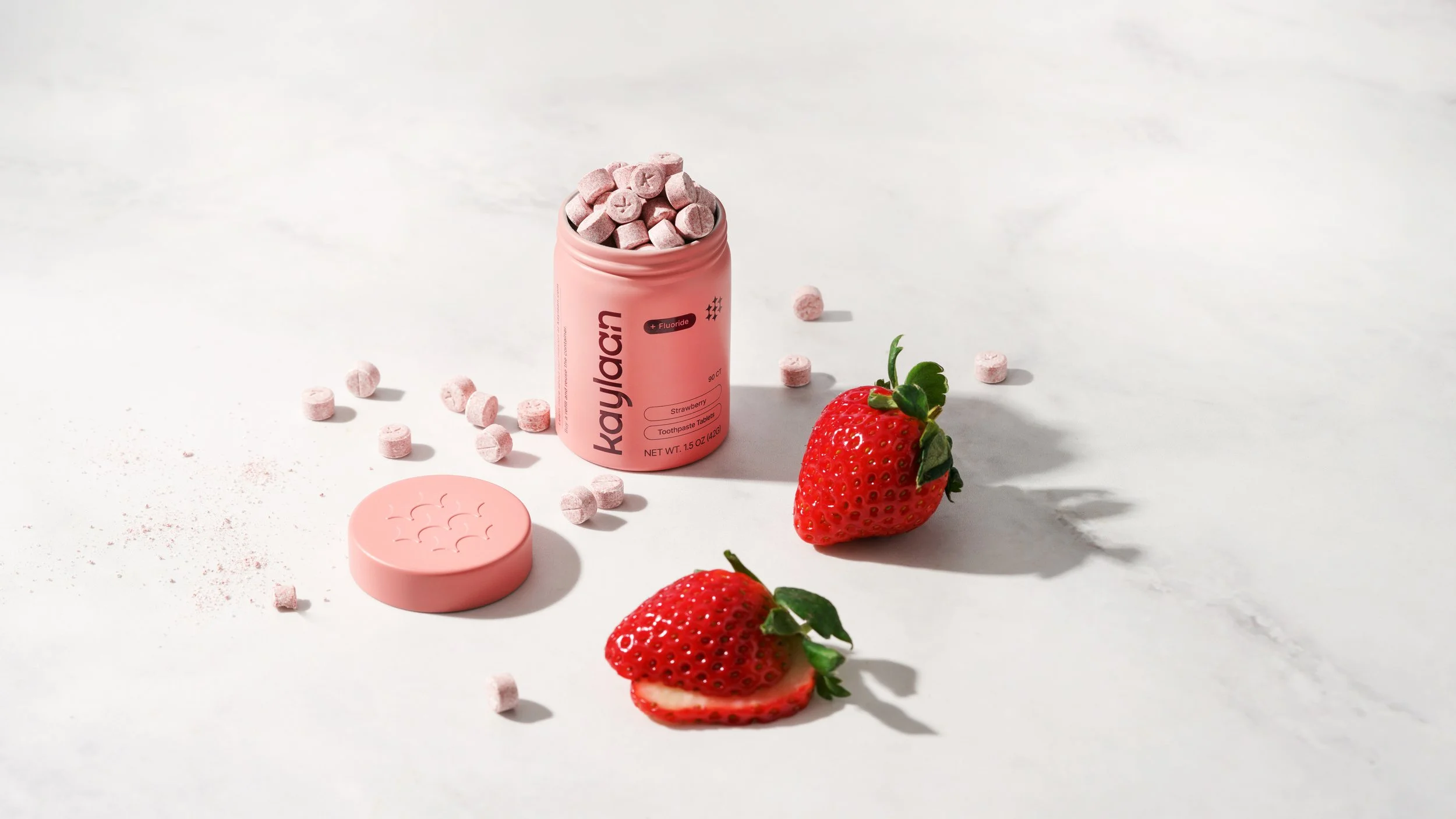
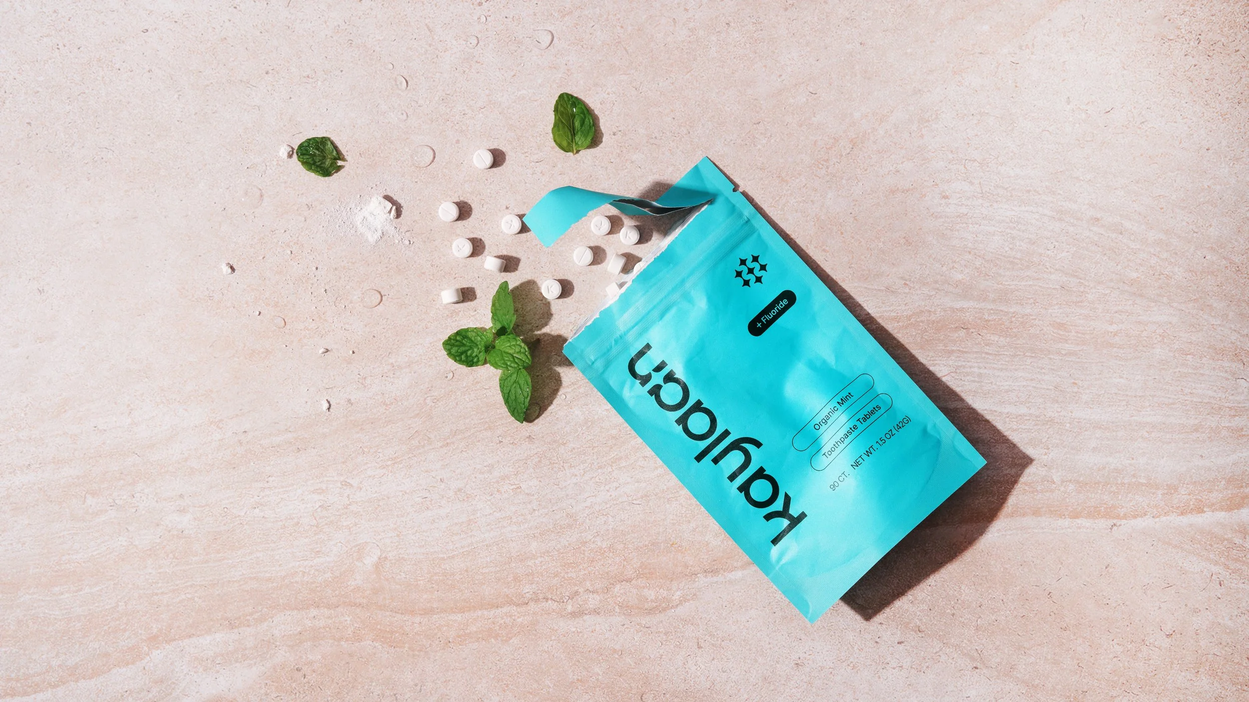
We kept the minimal, clean aesthetic that signals trust and legitimacy in oral care. But instead of blending in, we introduced a more expressive use of color to create distinction, improve flavor recognition, and bring personality to the brand. At the same time, we elevated the physical product itself, moving away from labeled tins to custom printed containers that feel more premium and less like a startup workaround.
This allowed Kaylaan to maintain the credibility expected in the category, while finally standing apart from it.
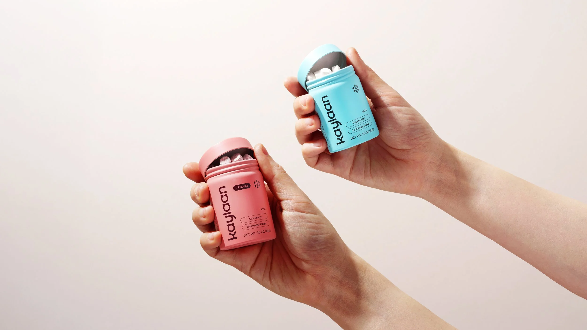
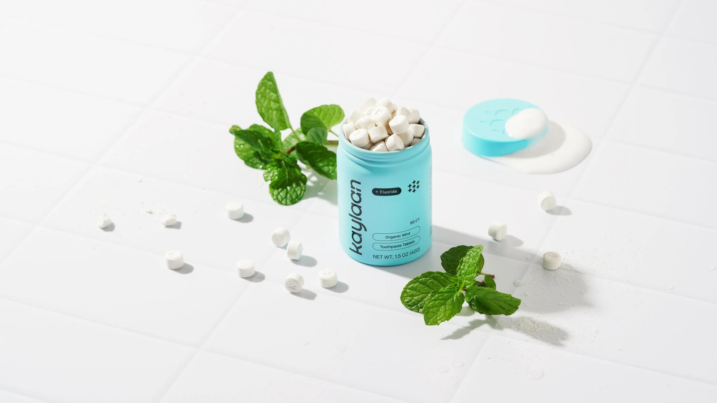
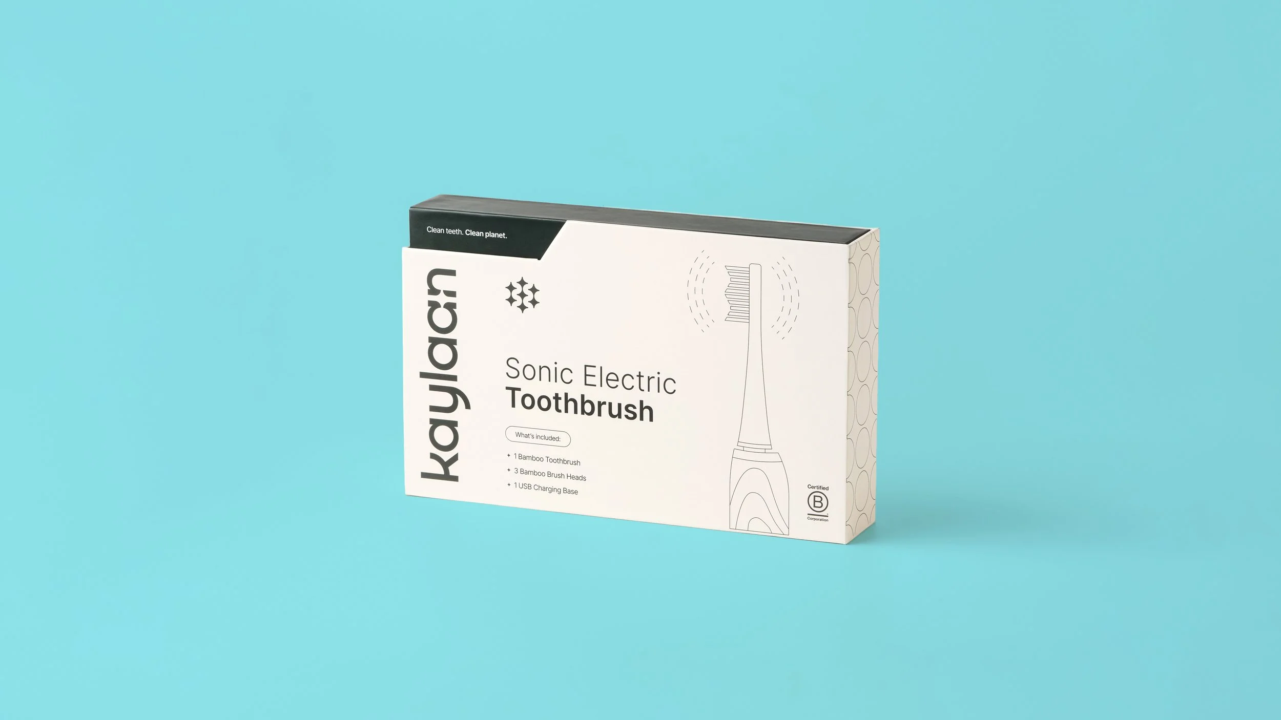
We developed a complete brand identity system, including a new wordmark, color palette, and typography. That system extended across a full packaging lineup, covering multiple toothpaste and mouthwash tablet flavors, as well as a sonic toothbrush, refill pouches, and sample formats.
Beyond packaging, we supported the brand with sales materials and trade show assets to help them present confidently in retail and wholesale environments.
The impact was immediate.
Within three months of launch, Kaylaan doubled their website conversion rate from 2% to 4%. Repeat and refill purchases increased, signaling stronger customer adoption. The brand also sold through inventory across online marketplaces faster than expected, requiring earlier reorders to keep up with demand.

Deepti Brambl, Founder
“Avidity Creative helped rebrand my company, and the results were exceptional. Their team is thorough, methodical, and genuinely pleasant to work with.”